#going through silly fonts and designs he thought was cool
Explore tagged Tumblr posts
Text
Happy late Melly Monday folks!
Time for another commission blog. And it's from a newcomer to the commission space. And that is Byx_Xeno and the collection of silly kicking bag comics of Aizel and Hero Melia
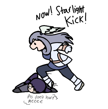
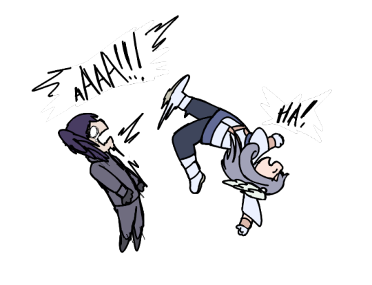

Byx is such a funny artist. Last year, she did a really great Sena meme that I'm pretty sure most of you heard of where she drew her in this very memey pose while saying "Yipee"
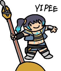
Which then garnered a lot of attention with it. And then she would put the Sena art in places where the art is in a diagetic world.


It really resonated with a lot of people last year. Which really captured my attention especially. It was until then where I saw this:

I think this was really well marketed for what Byx wanted to do. She didn't intend to do a lot of commissions at the time, but she wanted to find a way to make a bit of income while also being goofy and silly at the same time. And I think it worked really well.
So that's when I wanted to do my own "silly" commissions with Melia. I wanted to go with a more slapstick approach, which is when I thought of Melia's relationship with Aizel in Xenoblade 3. Where Melia loves to mock him because he is named after a previous soldier who failed to defend her. So conveniently, one of her personal guards just so happens to be named Aizel end up defending her majesty, and Melia is playfully mocking him in her ascension quest.

Obviously, Melia wouldn't *want* to hurt Aizel in this situation. Which is what the commission really is about. What would Melia do if she were to hurt Aizel in the most comedic way possible? Well... just STARLIGHT KICK HIM OF COURSE!

I think it's a very funny way to portray both Melia's character, and what I wanted for the comic strip. So that is where we went.
Unfortunately, due to a limit to how many images I can show on this blog, I can't really show the wip pictures. But they were really cool though. Byx did them on this interesting looking paper with a warm light in the background. I find it very unique and it's a shame I can't show it. Maybe in another commission blog, I can show the wips in detail.
But yeah, so how did the comics turn out? Well... they turned out fantastic! They just are so comical that it was just so worthwhile to commission her. They really seem timeless with the simple, cutesy designs and colors. The use of the dialog clouds and font being drawn in was so great. The expressions are also great too. Melia at the end smiling just cracks me up 😂. I also hope you all enjoy it too!
Byx always has her commissions open through Ko-Fi. Definitely check her out, as she puts in amazing work making silly art in both a diagetic and non-diagetic format.
That is it for today's commission blog. Tune in next week where we return to an old friend with a glorious Melia commission. Stay tuned for next Monday.
Oh yeah, there will be a bonus post coming in shortly related to the Byx commission. Stay tuned 😉
#melia xenoblade#melia#melia antiqua#xenoblade#art commissioned by me#fanart#commission blog#xenoblade chronicles 3#aizel#xc3 spoilers#sillyposting
11 notes
·
View notes
Text
Lies in the Lilies Snippet
Once Blake finally left I headed into the kitchen and assembled a cheese sandwich, putting it under the grill so it would end up nicely toasted. I was better off eating first if I wanted to remain focused.
Except the book kept calling my name, so as my sandwich cooked I found a knife and carefully sliced the box open, pushing aside tissue paper until the book presented itself. It was older than I expected, the leather spine cracked from heavy reading and gold lettering all but completely gone, and when I picked the book up several loose pages fluttered out.
I collected up the pages, hoping that it would be simple to slip them back in where they belonged, but it seemed this was one for the few books I'd seen that didn't have page numbers, leaving me to wonder just how I would go about doing this. Hopefully it would be obvious when I was reading through.
Or maybe, I thought as I picked up the final one, they fell out for a reason.
It couldn't be coincidence that the top page of my pile was one about an artefact that could block all magic, curses included. There was even a picture of a cool looking coin, which I figured was the thing.
I knew it was silly to put all my hope into a thing like this. Being anti magic it would be near impossible to find, and if anyone knew where it was they would be hesitant to say, out of fear of it falling into the wrong hands or being used against them. Still, I quickly sent off a text to Dad suggesting it to him. If anyone could find this thing at short notice, he could.
At the smell of burning cheese I dropped the pages I was trying to sort on top of the book and rushed into the kitchen, yanking the sandwich out from under the grill before it turned completely charcoal. I plated it up then returned to the couch, grabbing the tea towel I’d thrown at Blake on my way past, as apart from the bit he’d bled on it was actually clean and I wanted to make sure I didn’t leave cheese grease all over my new book.
I put my plate on top of the envelope Blake had given me, wiped my hands, then carefully opened the book. To my disappointment, there was no contents page, and flicking to the back I found there were no reference pages either. Though since I didn’t know what I was looking for, I wasn’t sure how useful either would have been.
The cursive font took me a moment to adjust to, especially as it appeared to be handwritten, but I was used to reading Mum’s writing and this was a little tighter and neater than hers. I loved cursive writing; it was so pretty and flowing and I wished I could write that way, but I’d never been able to learn. It wasn’t like I hadn’t tried - Dad even hired a tutor to teach me, keeping him on the payroll for a year, only for me to end up with worse handwriting than when I’d started.
It seemed I was going to be in for a long night of reading, so I put the book to the side and scoffed my sandwich, washing it down with a mouthful of vodka. As I went to put my plate back on the coffee table I paused, Blake’s plain white envelope staring at me in an accusatory manner.
I doubted it was anything relevant. Blake wasn’t really a trusted source of information, particularly with his insistence magic wasn’t real, and part of me figured it was probably a lame attempt at a joke. Assuming he even had a sense of humour.
All the same, my curiosity was piqued. I swapped it for the plate and opened it up, pulling out the single piece of folded paper inside. Unfolding it revealed a photocopy of a handwritten document, which as far as I could tell was written in Latin.
In quod eve autem quod finalem mensis, viginti quinque post quod tutus peperit, quod unus nomine Beth oportebit occursum eorum inevitabilis fatum uel quod occultatum imperium autem resurgemus, apud omnis stans adversus confutatis maledictus ut pereunt.
What on earth was Blake playing at? Aside from my name in it there was nothing about it that said it was something I needed, and for all I knew Beth meant something different in Latin. This text had to be a joke, surely. Something designed to distract me.
If that was his goal then he was succeeding. Inevitabilis fatum sounded worrying, as did occultatum, and the desire to know what it meant began to eat away at me. I needed answers.
Dad could probably translate it with ease, but I didn’t want to send it to him because I couldn’t be bothered with the hour lecture about wasting his time if I did so, so instead I typed it into Google Translate.
On the eve of the final month, twenty five years after the birth as safe as the one named Beth ought to meet their inevitable fate or they now control the rise, in standing against the chorus When they lost.
I let out a squeal. Even with the garbled text I was sure I knew what this was, so I bolted into my bedroom and pulled the burned photo of Mum and I off the wall, flipping it over to look at the text on the back. Comparing the two left me with no doubt that they were the same thing.
This felt like a lead, a proper lead, and I couldn’t help but do a little happy dance. Raine had mentioned a prophecy when I’d seen her and I was sure this was it, and I couldn’t believe I was actually holding it. I really needed to thank Blake.
The mere thought of him brought an end to my excitement. I wasn’t sure I believed his story about the safe - like why go to all that effort to get something if he didn’t even know what he was looking for? I figured he probably got it from his boss or something, possibly to keep me on side until he found a way to actually kidnap me. But then again, he had been in a fight, something that did match up with his story, and as far as I could tell his offer to help did seem genuine.
What I needed was a proper translation. Maybe then I would know for sure.
21 notes
·
View notes
Text
Rating Every Single Name of the Wind Cover
Why? Because I can. I am not a graphic designer, just a person with opinions.
Criteria for consideration: Must be a cover in a published edition of The Name of the Wind by Patrick Rothfuss. Hardcover, paperback, and ebook are all fair game, as are foreign language editions. Some editions reuse the same cover art, in which case I only rate one cover. Some editions modify cover art from another edition. If the differences are substantial, I’ll rate both.

Kindle March 2007 Edition
Ah, the famous shirtless redhead cover. This cover is a bit infamous in the fandom for being both bad and cringey. This is not good art. It’s cheesy. The shirtless aspect is silly, and the windswept hair is so windswept, you’d think Kvothe was in a tornado. Nice balance with the title and author text, although it looks like the title and author text are slightly off center.
3/10

Hardcover April 2007 Edition This is just a zoomed in crop of the above cover, which is a little lazy. It does make for a better cover image, except the creepy goat man bust has nothing to do with the plot of Name of the Wind. So I suppose they cancel out.
3/10

Mass Market Paperback April 2009 Edition
I despise this cover. It’s a lazy design, and the photo manipulation is terrible. Points I guess for good title text placement. But the photo manipulation is so! So! Bad! This is also the start of the trend of a hooded, cloaked figure with his back to the viewer staring out into the void. It is a bad trend.
2/10
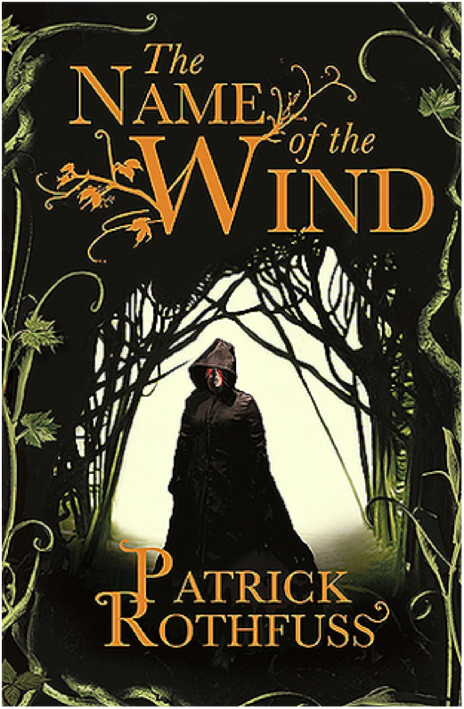
Paperback UK June 2008 Edition
We’re still with the hooded, cloaked figure, but at least he’s facing front this time. I like the embellishment on the ‘W’ in the title text, although it gets a little pumpkin viney. Overall, it’s an ok cover. It doesn’t make me cringe, but it doesn’t grab the viewer’s interest, either.
4/10
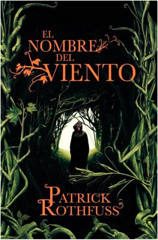
Paperback Spanish May 2009 Edition
Same image as the previous cover, but this one is uncropped and has a different plant border. I’m not sure how successful the changes are. On the one hand, shrinking the image of the figure makes the figure look more mysterious, which is good. But on the other hand, this is a bad plant border. I thought there was some corn on the right side for a minute.
4/10

Hardcover 10th Anniversary October 2017 Edition
10th Anniversary edition got fancy, and it shows. I love the ruin influence in the title text, which is a great callback to the use of ruins in the novel and also a more creative and unexpected choice than making the title text leafy. That being said, the “of the” in the title text is very oddly formatted and doesn’t fit the style. The cover illustration is pretty great, with lots of symbolism for old fans while still maintaining visual interest for new readers who are browsing and happen to pick the book up. The Cinder statue is delightfully creepy and much more relevant to the novel than the dumb pan statue from the earlier cover.
9/10

Paperback Turkish March 2007 Edition
Another trend starting here: Cloaked figure staring out at a city in the distance. I like the painting, at least what I can see of it. I find the choice to crop out most of the painting really bizarre. Is this supposed to be a telescope we’re looking through? And the leaves look like lily pads. The title and author text leaf embellishments are quite nice here, but I don’t know why there’s a metallic color shift. Overall, a poor use of space.
4/10
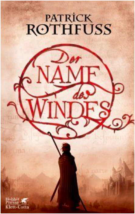
Hardcover German March 2007 Edition
Oh look! A cloaked figure staring at a city. What a surprise. I rather like the title text design, which is pretty creative and a good way to make the title visually appealing. I wish the city in the painting weren’t so damn faded and distant – I think it’s a mistake to keep the visual focus on the figure exclusively and only hint at the city beyond.
6/10
Paperback Portuguese September 2009 Edition
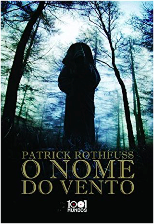
This cover is terrible. I would say the worst, but there’s more still to come. Anyways, this is incredibly bad. We’re once again with the hooded, cloaked figure with his back to the viewer, which is a lazy and uninteresting pose. The image is badly photoshopped and looks like an alternate movie poster for The Blair Witch Project. There’s nothing interesting about the image, nothing that interests the viewer. The title font isn’t boring, I guess. That’s the only good thing I have to say about this. 1/10

Paperback Portuguese July 2009 Edition
Still another cloaked figure staring off at a distant city, but this is one my favorite versions of this trope. The city is far enough in the middle distance that the figure is the main focus, but we can still see enough of the city to see that it’s cool looking. I’m glad to see the bridge from the books, which is a nice detail. The title text does a good job of filling in the empty space of the painting without crowding the other elements.
9/10

Paperback French November 2009 Edition
This is the same cover image as before, but it’s been cropped so that the figure is centered. I don’t like the change – the balance is better when the figure is off center. Also, the title text is way too big and dominates, which is unfortunate because the Spanish cover had such a lovely balance throughout. 7/10
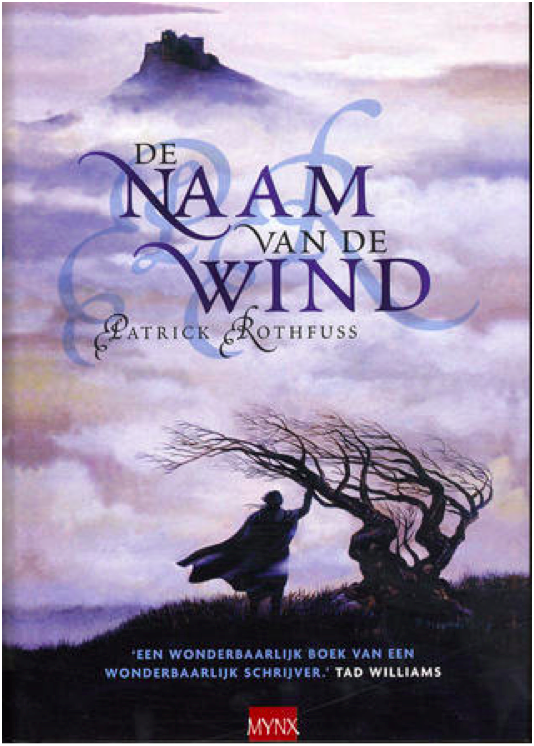
Hardcover Dutch July 2007 Edition
Yet. Another. Hooded figure. Staring. At a city. Wow. This one has a tree, at least. The image is… fine? I might be kinder to it if I hadn’t seen several better iterations of this right before. Because so much of the image is shrouded in fog, there’s very little to go on in terms of visual interest. And while I don’t mind the shadowed, muted color scheme, it also means that there’s very little to distinguish the cloaked figure and make him intriguing. The shadow initials behind the title text is horrific and obscures the title somewhat, so docking a couple of points for that. 5/10

Hardcover UK January 2017 Edition
Ahahahaha. This looks like the My Neighbor Totoro edition of Name of the Wind. It’s very silly and lighthearted, but wholly inappropriate for a book whose reading level is above first grade. If this was a kid’s book, I’d give it full marks. But Name of the Wind is very much for adults, and this cover is way too young and childish.
1/10
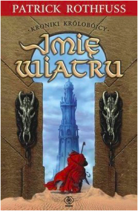
Paperback Polish August 2008
YIKES. I cannot figure out which scene or location from the book this image is trying to evoke, which makes me think the cover artist did not have the book or a text excerpt to work from. What the hell are those weird horse skulls? Why is this taking place in a desert? Why is the texture so bad? So many questions. And the effect on the title text is bad.
0/10 YES WE CAN GO LOWER THAN 1
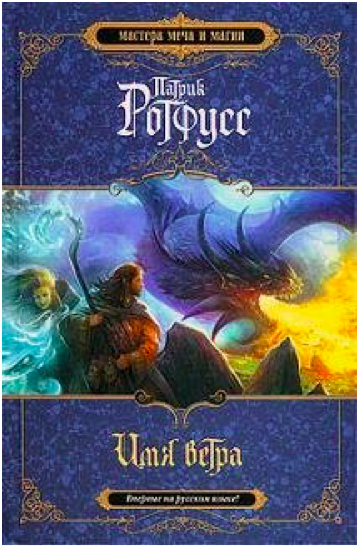
Hardcover Russian 2010 Edition
This looks like the cover to a Dungeons and Dragons manual. I suppose that’s supposed to be from the Dracchus scene with Denna, but the image doesn’t look quite right for Name of the Wind. It’s just so generic fantasy. I also don’t like how the image is cropped top and bottom to make way for a very generic marble background. Still, the image is colorful and exciting, even if it could be the cover for any fantasy novel ever.
5/10

Paperback UK 2011 Edition
What the FUCK happened here? Who let this shit happen?
-10/10
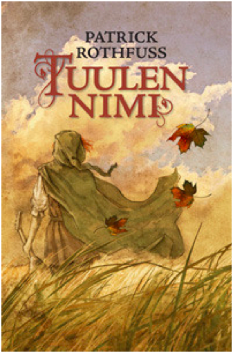
Hardcover Finnish August 2010 Edition
Ooooh, more Miyazaki fanart! This is actually quite lovely, and it fits the tone of the books much better than the kids book cover from before. I love how soft and gentle the painting is. Notice the color balance. I don’t know if this cover really ‘grabs’ you or draws interest, but it’s one of my favorites of the bunch.
10/10
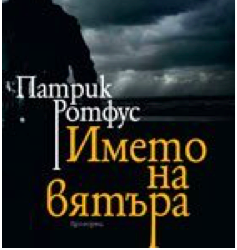
Paperback Bulgarian October 2010 Edition
I reserve the right to change my opinion later, but this may be the worst contender in the cloaked and hooded figure from behind category. I actually had to double check that this wasn’t a reused image from the mass market paperback edition, but nope! This is a brand new cover image, and it’s absolute shit. The lighting is so dark it’s impossible to make out details, the balance is way off, and the cover and title text are placed over the figure (aka the only object of interest) instead of the boring, generic storm clouds.
0/10
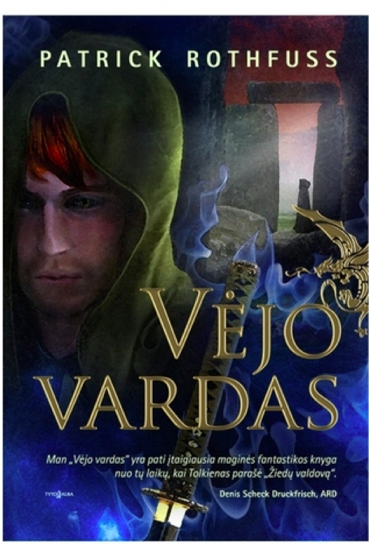
Hardcover Lithuanian 2011 Edition
YIKES times two. This cover art is truly awful in ways I didn’t know could still happen. Kvothe’s face looks ‘off’ because the facial proportions are all wrong. The blue mystical katana is bizarre because there’s no magical sword, much less a katana, in the story. And is that a photo of Stonehenge in the background? With yet another hooded figure?! I do like the gold foil of the title and the golden dragon embellishment, but the rest of this is such shit.
0/10
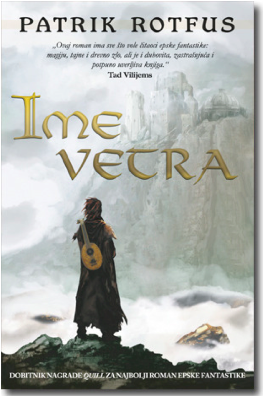
Paperback Serbian February 2011
And we’re back in the safe territory of a cloaked figure staring off at a distant city! All these covers are starting to run together, but this is a new cover art. It just looks like all the others. Once again, it’s fine. The city is a little too distant and greyed out to hold interest, and the figure is kind of generic.
5/10
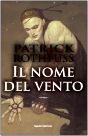
Paperback Italian 2008 Edition
I do not know what happened here. Who is this figure supposed to be? I cannot for the life of me figure out which character this is. It’s a shame, because it’s well-done art with a cool character and costume design. The title and author text obscure the image, though, and the shadow on the text is so extreme it’s hilarious.
0/10
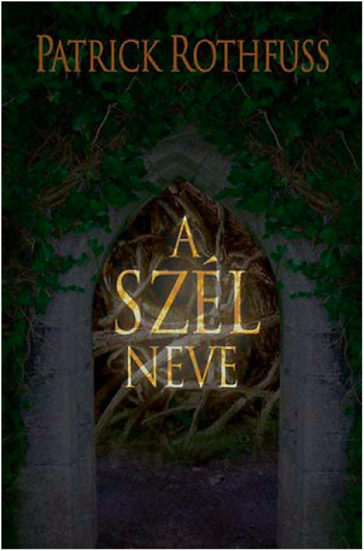
Hardcover Hungarian 2009 Edition
This is just boring. There’s no information conveyed here, nothing interesting or arresting to attract the viewer’s attention. The translucent overlay on the title is an odd choice.
2/10
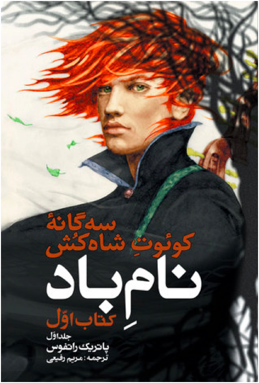
Paperback Persian 2016 Edition
I believe this was originally a fanart of Kvothe (correct me if I’m wrong please), but it’s a good one. The tree shadow in the back is distracting and obscures the handle of the lute on his back, though. I wish there was more here – it feels very spare in an unintentional way.
6/10

Hardcover Georgian 2016 Edition
Cloaked and hooded figure staring off into the distance, check. I’m not crazy about this one – the art is very soft in a blurred kind of way, and it reads as a little humdrum. The tower in the distance is quite dull – it looks like a modern office building.
4/10

Hardcover Italian October 2016 Edition
The title text is a little too high – I don’t like how it covers the figure’s chin. It’s not a bad idea to make Kvothe’s green eyes a focal point, and it’s certainly more of an original idea than most of these covers have shown. But the muted color pallete drags the whole mood down. It’s not evocative, just kind of damp.
5/10

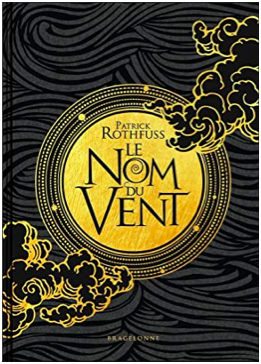
Hardcover 10th Anniversary French November 2019
I LOVE this cover. It’s gorgeous. I love the gold foil, love the text, love the clouds. It’s stunning and timeless. Amazing.
10/10
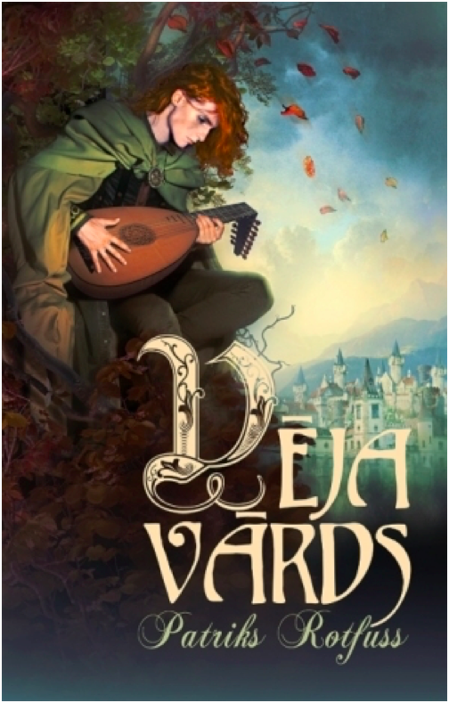
Hardcover Latvian October 2013 Edition
It’s a cloaked figure with a city in the distance, but he’s NOT looking at the city! What!! I’m rather surprised at how few covers feature Kvothe actually playing the lute – this may be the only one, actually. I don’t like the bottom fade, and I think the design is a little generic fantasy. But it’s a nice balance, and the title text is fancy and eye-catching.
7/10

Paperback Polish 2017 Edition
This cover artist also clearly wasn’t working off an excerpt from the book. The character design is so off and unlike Kvothe, except for the cloak. Wall texture looks like a photo manipulation, which is cheap. This whole thing is bad.
0/10

Hardcover Russian 2015 Edition
What is with the Stonehenge imagery? And why is that guy floating off of Stonehenge in a modern hoodie? Why is that one leaf in the top right so huge? Why is the title text red and difficult to read? At least there’s a broken lute, I guess.
1/10
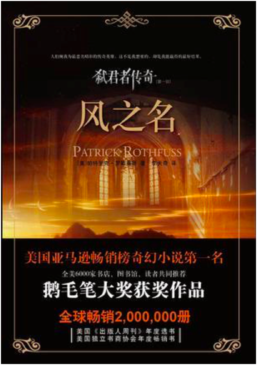
Paperback Chinese May 2012 Edition
This is incredibly lazy and the photoshop job is terrible and generic. Zero effort was put into this cover.
0/10
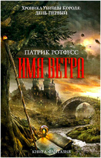
Hardcover Russian 2011 Edition
I’ve been pretty harsh on Russia, mostly because the Russian covers have been terrible. This is ok-ish. It’s very generic fantasy, and the castle looks like Hogwarts. But it has visual interest, even if the title text color is garish.
2/10

Japanese 2017 Edition
I quite love that they turned Kvothe into an anime character. And he’s doing stuff, too, and not just staring out into the middle distance. There’s so much imagery of the broken lute in these covers, so it’s refreshing to see the other part of this scene – when Kvothe loses his shit and finally calls the name of the wind. Fun cover, good artwork. The red title text works here because it matches Kvothe’s hair.
9/10
WORST:

BEST:
#The name of the wind#kingkiller chronicle#patrick rothfuss#book cover art#books#apologies for poor image quality i was working with what god and goodreads gave me#which was variable image quality i guess#I've been told I'm very judgemental so I decided to put those judgey skills to good use
49 notes
·
View notes
Note
Could you do something where Minimus sees his fem human s/o dressed up in a Halloween costume and she wants him to join in since the rest of the crew (thanks to Swerve and Rodimus) are all participating in a huge Halloween party, complete in costumes? Sorry if I did this wrong. Let me know if I went about doing this the wrong way if I did do it wrong.
Minimus Ambus / Ultra Magnus X Reader – Costumes
A/N – Man, this is done now so only like three or four to go? The others will hopefully be done tonight, but this week I’ve just started my depression meds and boy, they’re a real kick in the head. So anywho, powering through hopefully.
Warnings – None.
Rating – T
Loud pounding at the door. Why did it always have to be loud pounding? Why were you never awoken by a sweet chorus of angels, or a serenade of doves? Nope, whenever someone wanted something from you, which was often as the only human on the ship, it always began with an urgent wakeup-call.
“(Y/N)!” Rodimus hollered. “(Y/N), you’ve gotta get up.”
You groaned into your pillow, not bothering to even check the time; everything from your befuddled mind to the time-adjusting lights told you it was far too early for any sane person to be awake.
“(Y/N),” Rodimus crowed again. “Come on, get up.”
“Minimus,” You mumbled, reaching out for your partner, but missing. “Minimus, he’s your ‘sponsability before seven.”
Rodimus pounded on the door again and you looked around groggily, sighing when you realised Minimus had left you in the night again; occasionally, you wished he would spend the entire night with you, though that wasn’t likely to happen anytime soon.
Half-jumping, half-falling, you got off the berth, making your way to the door which Rodimus was still banging on. His voice was now joined by Swerve’s worried one, asking if this was the right time to be bothering you.
You opened the door, grunting unappreciatively. Swerve blushed at the sight of you in your night clothes, having never got over his infatuation with humans. It was fairly common knowledge that he had a huge crush on you, though he tried exceptionally hard not to show it, especially since you had started dating Minimus.
“Uh (Y/N),” Swerve breathed. “Nice to see you here- I mean, not here, you live here, so obviously we would see you, especially since we came looking for you. Did we wake you up? Sorry, I know we did. I tried to tell Rodimus that this was a bad idea. I said, ‘Rodimus, 1AM is too early,’ but he said-”
Rodimus clamped his servo over Swerve’s mouth, ending his babbling and patting the mini-bot’s head sympathetically. “Take it easy buddy, you’re going to blow a gasket like that. (Y/N), you silly bird that I can’t remember the name of.”
“Goose,” Swerve mumbled against Rodimus’ servo.
“Right, goose, that was it. Anyway, you didn’t tell me about Halloween now, did you?” He waited for the obvious no that was to be your reply. Instead you yawned and rubbed some sleep out of your eye, entirely devoid of the energy required to carry out a conversation.
Continuing his spiel as if you had spoken, Rodimus shook his head disappointedly, “No, you did not. I mean, you mentioned it in passing and I had to hear from Swerve here about those epic costumes.”
“Rodimus,” You glowered. “If you’ve come here to ask about a costume contest at ONE IN THE MORNING, I swear I will tear out your vocaliser and feed it to scraplets.
“Wow. That’s just rude considering I’m only trying to make you feel at home with YOUR holiday.”
“I’m going to choke you with your own neck cables.”
Swerve swallowed anxiously and you shot him a soothing smile, “Don’t worry Swerve, you’re safe for trying to stop this lunatic.”
Swerve muffled a polite ‘Thanks’.
Rodimus finally let him go to reach into one of his sub-spaces for a datapad. “Look, just sign this form from Ultra Magnus so we can host the contest. He said we have to get your permission so it’s not, ‘cultural misappropriation’ or whatever.”
You held out your hand bemusedly, any anger dissipating as a solution to get rid of the pair presented itself; you would sign your soul away if it meant getting more sleep. Rodimus handed the datapad over eagerly, his engines revving loudly, giving you a headache. You glared at the form on the datapad, then at Rodimus.
“Rodimus,” You sighed. “This is just a memo that says ‘I can do what I want.’”
Rodimus blinked in surprise, then spoke behind his servo to Swerve, “I thought you said that passed as an Earth contract.”
Swerve shook his helm, “No, I said that in this show, Parks and Recreation, there’s this guy Ron who- It’s pretty funny, he’s the guy that-”
“UGH!” Rodimus leaned back dramatically, “You mean I actually have to do my job and write a lame report? BORING!”
“Rodimus,” You scowled, clutching your aching head. “If you shut up and leave, I will personally write up and sign a consent form for you to take part in Halloween.”
Rodimus shot finger guns at you, “You’re aces kid, see ya.”
And just like that, he was gone, wheeling his way down the hall in his alt-mode. Swerve stood awkwardly on his own, fumbling with his servos, clearly unsure of the social etiquette of what to do next.
“Uhm,” He said almost shyly.
Taking pity on him, you managed a sympathetic smile, “Yes?”
“I- I really like couples costumes, so if you uh- if Magnus won’t wear one with you- I um- Maybe you and I could go together? I mean, not as a couple, but as partners, or something?”
“I’ll think about it.”
“Really? That’s great. I’ll uh- I’ll catch you later.”
Swerve hastily transformed and drove away, finally leaving you to get the sleep you desperately needed.

You knocked on the door to Minimus’ office, knowing how much he valued his privacy. Never once since you had met him had you ever just walked into his office; it was one of the many things he loved about you.
“Come in,” He said, his voice deeper than usual which told you he was in the Magnus armour.
You smiled, entering the room, “I have a report for you.”
Ultra Magnus’ lips twitched at the corners and if it was anyone else, you would have wondered why they were frowning; as it was with Ultra Magnus, you practically melted because that was his equivalent of spinning you around in elation.
“You should save that for the berth,” You joked, handing him the datapad.
Shortly after he glanced at the report, he gaped opened-mouthed at you. You had used the ‘Book Antiqua’ font, which was the most seductive of all the fonts. Ultra Magnus could barely read it without getting giddy, his cooling fans switching on with a low buzz.
“I-” He cleared his vocaliser, sitting ram-rod straight in an attempt of maintaining some professionalism. “Thank you, I shall see to it that Rodimus is allowed to perform his Halloween preparations immediately.”
“So, you’ll sign it off?” You asked, needing Ultra Magnus’ signature as well as your own to carry out any event on the ship.
He nodded, scrolling to the bottom, hardly able to keep a straight face with that piquant font daring him to flirt with you. Later, he would have to respond in kind by giving you the kind of report you liked, with the enticing pictures attached between the terms and conditions. Signing it hastily, he put it aside so as to calm himself by not looking at it.
“Wow Magnus, you aren’t yourself whenever you see that font, you know.”
Magnus frowned at you, surprised by your words, “I do not understand.”
“Apparently, you get so flustered-”
Ultra Magnus blushed, waiting for some kind of invitation that he wasn’t prepared for.
“-That you didn’t read all of the terms and conditions.”
He gasped, picking up the datapad again, this time ignoring the ever so alluring font to read everything that was written. Finally, he reached the point you were referring to, whimpering a small, “No.”
“Yes,” You nodded.
“(Y/N), how could you?”
“I’m sorry Magnus, it had to be this way. You would have never agreed to it if I’d just asked, and well… it is a part of my planet’s culture and traditions.”
Ultra Magnus read and reread the stipulation again: Should this be signed by both (Y/N) (L/N) & Ultra Magnus / Minimus Ambus, then the pair shall be entered into the costume contest, in costumes of (Y/N)’s design.
Sighing once more, Ultra Magnus put the datapad down once again. He pinched the bridge of his nose, “Just tell me one thing (Y/N). Why?”
You thought of all the holidays and events you missed out on because of Ultra Magnus. Usually, you didn’t mind, knowing how uncomfortable they made him, but the recent memory of wanting him to spend the night with you was too fresh to ignore. You grinned, “Because, Halloween is the one time of year that I have to get at least one trick in, but don’t worry, I’m sure you’ll never fall for that ever again.”
Ultra Magnus scowled. You were right; he would never fall for such a trick again.

“Okay,” You said from your position in Ultra Magnus’ servo, admiring the Halloween paint job on the armour. You looked at the stage from behind the curtain that had been put up. Riptide was there, dressed as a Rodimus Star, and you had to give him points for creativity if nothing else.
You beamed jovially, “You ready?”
Ultra Magnus was frowning beneath the new face-plate, but he nodded anyway. You had to really admire his handy-work. When you made him agree to this, you didn’t think he would put his best effort in but he did, and now with you dressed in a pilot cap and jacket as Hogarth Hughes and him painted the silver Iron Giant, you were having the bests time of your life.
“I am totally ready,” Swerve practically sang from Ultra Magnus’ side, shaking on the spot with anticipation.
Ultra Magnus glanced distastefully down at Swerve, wondering again why he was there. As it was, you couldn’t stop thinking about Swerve’s desperate need to fit in, and though it wouldn’t help with his crush on you, you had decided to invite him to join you and Ultra Magnus in the contest. With you as Hogarth and Ultra Magnus as the giant, Swerve was left with three choices to complete the ensemble; he could either go as Kent ‘I work for the government’ Mansley, Dean McCoppin, or Annie Hughes, Hogarth’s mother.
In Swerve’s words, he didn’t want to be a villain, so Kent was out, nor did he just want to be spray painted black which removed Dean from the equation. That was how you ended up with Swerve in a pink 60’s diner outfit (that Ten had sewed) and a brown wig, which you presumed was also created by Ten.
Finally, it was Riptide’s turn to leave the stage and go to the back of the mess hall which had been repurposed into a party room, complete with bubbling cauldrons and smoking coffins; you were sure you had seen Chromedome and Rewind canoodling in one of those coffins, closing the door behind themselves shortly thereafter.
“Right,” Rodimus in his alt-mode as Lightning McQueen called; he was the sole judge since most everybody else wanted to be in or avoid the contest completely. “And next to try and top MY ACTUAL FACE ON RIPTIDE, we have (Y/N), Swerve and- WHAT! YOU’RE YANKING MY CHAIN. ULTRA MAGNUS.”
Ultra Magnus used the servo that wasn’t carrying you to cup his helm with a heavy sigh as Rodimus burst into a fit of hysterics. He wanted to ask you if he really had to do this, but even if you let him go, he would feel unlawfully guilty; breaking a contract was no small matter. Besides, he knew he never gave you enough time. You could be with somebody else who was what you needed, yet you chose him anyway, loving both Ultra Magnus and his smaller form, Minimus Ambus. Should you stumble on an unpleasant part of his past, you wouldn’t press him too hard to tell you, rather waiting for him to come to you with the stories of how the events of his life had unfolded. For your kindness, patience and unconditional love, Ultra Magnus knew he would suffer a thousand of these infernal contests.
As such, he stepped forward carrying you and closely followed by Swerve. Seeing your trio did not stop Rodimus’ laughter. Instead, he transformed to his bot mode so he could hold his side as he fell about laughing. “The Iron Giant,” he squeaked, almost tearing up. “It’s so cute, I thought- HA! I thought- it could’ve been like Law & Order- HA HA HA. OR JUDGE, JURY, EXECUTIONER WITH THE THREE OF YOU!”
He slapped his side and it was another twenty minutes till he stopped laughing and finally scored the three of you. Finally, by the last costume, Nautica as an incarnation of Doctor Who, the contest drew to an end. Although Rodimus was greatly amused by Ultra Magnus in a costume, your trio came second; evidently, Rodimus’ ego could not be defeated and Riptide the Rodimus Star won, earning an actual Rodimus Star for it.
“Alright,” You smiled after the awards. “You held up your end of the bargain, now you can be free if you want Magnus. I know you hate these social gatherings.”
Ultra Magnus swallowed anxiously. He did desperately want to get out of there and he was appreciative that you understood that, yet he couldn’t let it go unsaid that the contest hadn’t been completely horrible as he had first expected.
“(Y/N), my darling,” He said, whispering it so only you would hear, afraid of too much PDA.
“Darling?” You smiled. “My, what’s got into you? You haven’t got a fever?”
Ultra Magnus knew you were teasing, though he hoped it wasn’t a real criticism buried beneath. “I- Tonight was not- I um- Do you enjoy this tradition of dressing up?”
“I do. It’s the one night you can be someone else and it’s kind of just one night to be silly on Earth, I guess.”
“Then- We shall do this again next year.”
“What?”
Looking around to make sure nobody was watching, Ultra Magnus retracted his face plate and kissed your cheek, quickly sliding his face plated back afterwards. “I want you to feel cherished while you are with me, (Y/N). I love you and… You should not have to miss out on enjoyable moments for me. Let us do this again?”
Frankly gobsmacked, you simply nodded and Ultra Magnus pressed his helm against yours. You didn’t know it yet, but this would be the first night since you moved in with him that he would stay till you woke up; what had started out as a silly costume contest, had become a precious reminder for Ultra Magnus to get every precious moment he could with you.

Like my work? Buy me a coffee and earn preview of the next fic, or commission me on the commissions page.
#ultra magnus#ultra magnus x reader#minimus ambus#minimus ambus x reader#reader#reader insert#swerve#rodimus#mtmte#ll#more than meets the eye#lost light#maccadam#the lost light#idw#idw transformers#transformers#fanfiction#fanfic#costumes#halloween#bootyshakerkegrimm
178 notes
·
View notes
Text
Dishonored 2 - LC - Impressions
My first impression of the game was very mixed (great gameplay and visuals / cringy dialogues and poor writing, good actors’ talents wasted), but further along the good outweighed the bad. So, yes, it was an enjoyable game, all in all not worse than the original - totally worth playing.
So far I did a Low Chaos Corvo. Later I’ll also share the impressions on High Chaos Emily.
Lots of spoilers (and some screenshots) below cut.
Let’s start with the weak points of the game:
Non-mute Corvo. Having a silent protagonist in the first part left Corvo very open for interpretation. The Corvo I heard in D2 was not Corvo to me. As much as I like Stephen Russell as Garrett, his Corvo felt like a week-old piece of bologna that someone microwaved out of sheer desperation. It’s not his fault, though. I think it’s the writing and whoever directed the voice acting. I blame the same party on my next issue.
Jessamine / The Heart. In D1 I would go out of my way to poke everyone and every location with the Heart to hear what it had to say. Its lines were fun, inspiring, eerie. In D2 I would accidentally click the Heart and shudder in disgust at Jessamine’s lines. 90% of the time they were clumsy, unimpressive, banal and spoken in almost the same tone regardless of the graveness of an NPC’s crimes. Speaking of which a ridiculous number of the NPCs turns out to be psychopaths or assholes with no redeeming features. The fact everyone except the main characters only gets one line makes it even worse. I understand why they did it technically, but the end result was awful. I never played High Chaos in D1, I couldn’t bear to kill any of those people because each of them had a bit of good and a bit of bad in them, just like real people. It was an integral part of Dishonored for me, the message that most people will do horrible things during a crisis, but that there’s still hope for them and killing them is bad. But D2 seems to go out of its way telling me “you know what, they’re all assholes, annoying unlikable assholes, kill them all”. A weird message to send when you want people to get a good ending. As a result I can’t wait for the HC playthrough where I’ll slaughter every living person in the Empire. It will feel so good.
Generally, the weakest link in the game for me was the writing. Interestingly, the more important the character, the weaker their lines, with Corvo’s early game lines being some of the worst, while some banter between ordinary citizens was fun, witty and refreshing. Also I get the impression the message the game tried to deliver kept getting lost in the clumsy storytelling. The Outsider and Sokolov would tell us how Delilah has such potential to change the world for the better, and then we return to Dunwall, and it’s a post-apocalyptic mess, and her plan for ‘improving the world’ is filling it with statues of herself. The Outsider would preach that being a witch is so much better than being in a loveless marriage, then we meet the witches, and they’re a bunch of murderous psychos. For a game about how oppressive institutions are bad Dishonored 2 sure keeps flopping on the show-not-tell part. At the end of the day, despite all the in-game finger shaking, I feel fully justified siding with the Overseers. According to Jess, most of the people on Karnaca are some flavor of violent criminal. Might as well let the zealots have their way, the only way from here is up.
Ghost Jessamine is another complaint of mine. Her being more than a piece of meat stuffed with clockwork takes away from the mystique surrounding her state. Her in-person ghostly conversations with Corvo make her feel alive rather than an echo of her former self, taking away from the strong impression the Heart created on its own in the original game.

The Voguing in the Void. Bad writing makes it hard to take characters seriously. Having them teleport and take a different pose every time they utter a sentence only makes things worse. Maybe the intention here was to make me want to kill the Outsider in the new game? If so, good job.
Continuing the Dishonored tradition of introducing a female character and killing her off in the first three minutes of the game. And then telling us post-factum how noble, good and interesting she was. Only this time after one more mention she is completely forgotten, which is even worse than last time. I’m talking about Captain Mayhew. Cool design, ok story, but feels extremely like a token character. Maybe her part in the story was meant to be bigger, but got cut? I don’t know, but she felt completely unnecessary, so did her death. At least Jessamine and her death were integral to the plot of the first game.
The atmosphere of the game wasn’t as strong as in the original. I blame the Heart for it. The Heart and the weak storytelling (not the weak story, the story was actually alright).
The bloodflies were less of a threat than the rats in the first game. Most of the time you could sprint to their nest and wack it to pieces without even getting hurt. They should be harder to get rid of to live up to their intimidating reputation.
Oh, and this:

(whoever decided to use this number of fonts needs to go back to design school)
Now, you might think after all those complaints that I hate the game. I thought I might, but I didn’t. After I got used to the bad, the good eventually shone through and dominated my impression. Here we go:
Music. The music is just as good. Such a pity Daniel Licht is no longer with us. May he rest in peace.
Gameplay. No complaints here. The levels seem bigger and more fun than in the original game, sneaking is a little tougher. No more killing people by throwing them on beds. Being able to use the Heart on unconscious people, the unconscious indicator is a great addition in its own right.
Meagan Foster and Sokolov. Ok, the writing on these two was actually pretty cute and solid. I wonder if different people worked on these two compared to Corvo and Emily, or if it was the same writer, but having a bad/good day, etc. For once, I love how Meagan was written.
Kirin Jindosh. I didn’t get too much of him because he never knew I was there, but from what little I saw of him - best baddie in the game. 11/10, would reduce to below average intelligence again.
Good Guy Overseers. Yes, they will drown the occasional kiddo because witchcraft, but come on, their preaching is pretty reasonable. Notice how the Abbey actually comes last. Sounds better than many real world religions to me.

The Overseers were the turning point in the game’s writing for me. I realized the NPCs actually say fun stuff, it’s just the main cast that’s being boring.
The visuals. Often with a new game in a series I fear the HD-photorealism takeover, but Dishonored 2 stayed loyal to its artistic direction while making things more high-res. It’s beautiful.
The second half of the game. I thought the Clockwork mansion would be the best part of the game, but then I was very surprised to discover things actually truly picked up in the Dust District, or more precisely in the mansion. The time-shifting was a great addition to the gameplay! Moreover...
The plot was decent. The storytelling was kinda mediocre, but the story they were trying to tell was actually quite fun. Breaking Jindosh, saving Stilton and replacing Abele were some of the highlights of the game. There was a number of rather fun twists, like Delilah and Luca actually being truly in love?? Who saw that coming? I didn’t. I thought she was just using him, like she was using Breanna, but then in the end she calls him ‘my love’ right after expressing nothing but cold disappointment that Breanna is no longer a useful tool. That makes Delilah a little less of a calculating cold monster and a bit more human. For once, I actually sort of like her after hating her guts since forever. So that’s pretty good.
Giving Billie her arm and eye back. Holy shit, that felt amazing.
Keeping with the good tradition of not-in-your-face gay characters. The occasional Overseer who dates millers behind said millers’ wives’ backs. The emphasis on how close the old Duke and Stilton were. Good stuff.
The Oracular Order and its role within the Abbey were expanded upon.
Killing Paolo in slow-mo and gobbling up all the white rats.
The non-lethal takedowns were all satisfying.
The very freaky nest keepers and their delusions.
The Ultra Low Chaos Happy Ending:


(look, Mom, both hands!)
My conclusion from all of this is that when I play High Chaos I will try not to use the Heart almost at all not to spoil the fun with Jess’ banalities. And I will let Jindosh know I’m there so he can comment his heart out about my escapades around his home.
I am so pumped for the Death of the Outsider now, because if Dishonored finally manages to address its theme properly, that would be nice. Also, finally playing as Billie is amazing, and killing the Outsider sounds like fun to me (please, remember I enjoyed low chaos Jindosh take down). I won’t be watching any more trailers, gameplay videos and such, I prefer to go into a game with minimal knowledge. Thankfully the game will be out soon enough. I will doodle some silliness meanwhile. Also, D2 left me wondering about what would happen to Heathen-Go-Lucky folks under Delilah. Pretty sure someone would end up turned to stone. XD
#dishonored#dishonored 2#low chaos#video games#text#long post#all opinions are personal#maybe you enjoyed the writing more - that's fine#everyone has different tastes#if someone's vision of Corvo actually coincided with what they saw in the game - great#I'm happy for you
13 notes
·
View notes
Text
what i was reading recently and some other cool stuff
some stuff I’ve been reading recently. I’ve had a few books arrive as well –– gonna wait till the weekend and post pictures of them all at once though.
I read the first half of this old tezuka thing, angel island

rather odd work, could get whiplash going back and forth over the plot development at the beginning. some funny stuff. probably not his most notable story. The melodrama is real.. kinda. it get’s a little more interesting / silly further in. It’s hard to decide if the main villain is scary or humorous.
~ some more stuff posted after the break ~
I also read joou sama no eshi by kaworu watashiya. dang this manga is really good. really funny, especially - lots of biting humor. And it’s interesting to look at watashiya’s art - it’s really developed a flexibility. She mostly sticks to drawing a kind of full-bodied sensual style for this one, but oscillates back and forth, with some sections that parody other manga styles or give clever commentary seemingly on watashiya’s own experience as a mangaka. The characters are well written overall, feeling like genuine high schoolers (or struggling mangaka turned temp teacher) without becoming overly annoying archetypes.

Like for example, this is a manga that some characters collaborate on as a manga club project –– watashiya nails the contemporary moe design and font typography.
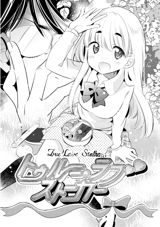
and then later the mangaka is working on an accompanying manga for an in-production anime, and again watashiya has the art style down pat

I tried reading the water dragon’s bride, but it was really bad. This was one of the few pages I liked.

it has nice covers, but just.. there’s not much there it seems, to be honest. disappointing - well, at least that’s what I got from it. If it gets better let me know.
I also read ressentiment, and that one was pretty good though it started going a little off the rails towards the end. Hanazawa did a really great job of creating striking contrasts/parallels between certain panels.

I really liked the tone of this scene. The earlier mysterious stuff involving Noah was curious as well, though there was some stuff that wasn’t followed up on, which would have been nice to know more about.
Another really enjoyable read was toyoda minoru’s takeo chan bukkairoku, the story of a matter of fact girl cursed with the most unbelievable perpetual bad luck. His writing is so snappy, and his art so stylistic, it’s just great. shades of yamakawa naoto in that solid inked, geometrical design and thick lines. Very much his own thing though, artistically.

Geez his art is so cool
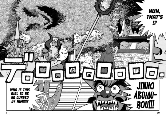
Actually. I also finally got around to reading Made in Abyss - I even watched the anime too, it was pretty good, especially thought (for the anime) the soundtrack was very well done. The art in the manga is really striking and very different from most others’ work. very ethereal feeling, I gotta pick up some more tankobon for this one. See what else the author’s worked on.

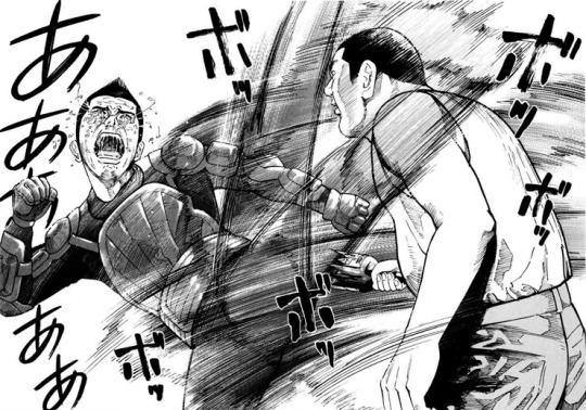
Contrasting sharply with those, I finished the murder fantasia “Ichi the Killer”. That one was okay - good at times, but the ending again left me disappointed. Also, the plot was overall, much too predictable, which is fine but the few things that would have made it more interesting, such as explaining more of the character of “oji-san” never came to pass.. and then some aspects of the ending just felt kind of weak - disconnected from the story’s psychological set-up. Overall it was an alright read though, but I definitely liked homunculus more. extremely violent.
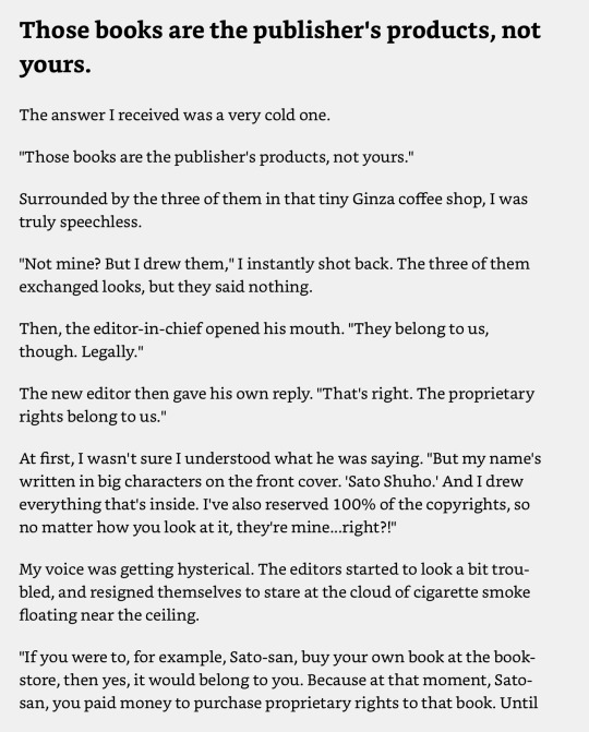
I (finally) read this short but very interesting book by sato shuho, who is probably considered a bit of a maverick mangaka I suppose, about his experiences and effort to change the publishing model in Japan, and shift to self publishing his books through an online portal (mangaonweb). Lot of very interesting stories in it, and it reads very casually, like a series of blog posts. It’s super cheap, so I definitely recommend checking it out (got it as a kindle ebook).
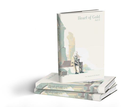
Other interesting news... there’s a webcomic “Heart of Gold” running a kickstarter to print physical books, which wraps in a couple days:
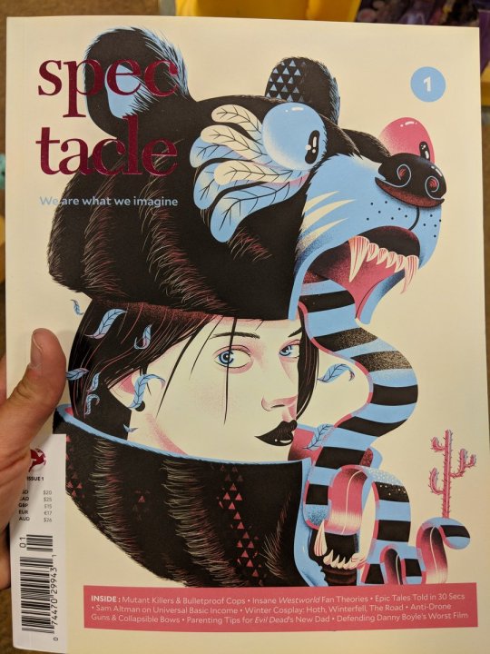
I saw a cool looking magazine on twitter, I might pick up a copy if future issues have more interesting content..
Also kind of interested in this German comic coming out soon (maybe already out, I didn’t actually check the specific date!?)

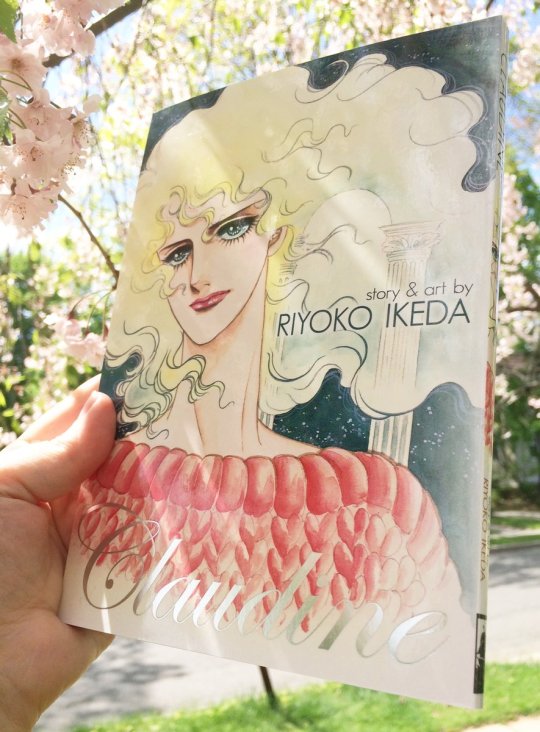
and I’m really excited about seven seas’ release of Claudia, someone posted a picture on twitter a while back and the book looks really pretty.
I saw this dojin online.. don’t know much about it, but the cover’s really neat so.. I might end up picking it up. I guess it’s some kind of fan book.

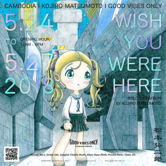
There was a cool kojiro matsumoto exhibition not too long ago as well. He also did a group one with a couple other cool artists.
My DeDeDeDe shirt got positive comments.
Oh also Inio Asano was at TCAF:

As for me, I tried making a niconico account with country set as Japan, but it still wouldn’t let me watch vids from Japan.. I assume through browser profiling? Anyone else done this, do I need to just get a vpn or something? Was too lazy to try and figure it out.
I’m dealing with a lot of job related stress right now, so just trying to get through this stretch.

0 notes
Text
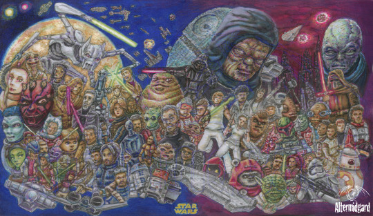
Star Wars Custom Playmat 100+ Characters
Just make it look cool.
Right. Anything specific you wanted?
Not really...Just get as many characters on thee as you can.
Challenge Accepted.
Yes today on the blog, one slightly vague choice of words leads to the most characters ever on one of my mats. Not by a small margin either, especially if you include vehicles (Which I do, objects are objects in programming) I'll be going over the phases of the mats design from concept to colouring telling stories as I go. We've got a lot to get through, so lets jump right in to my latest Star Wars mat.
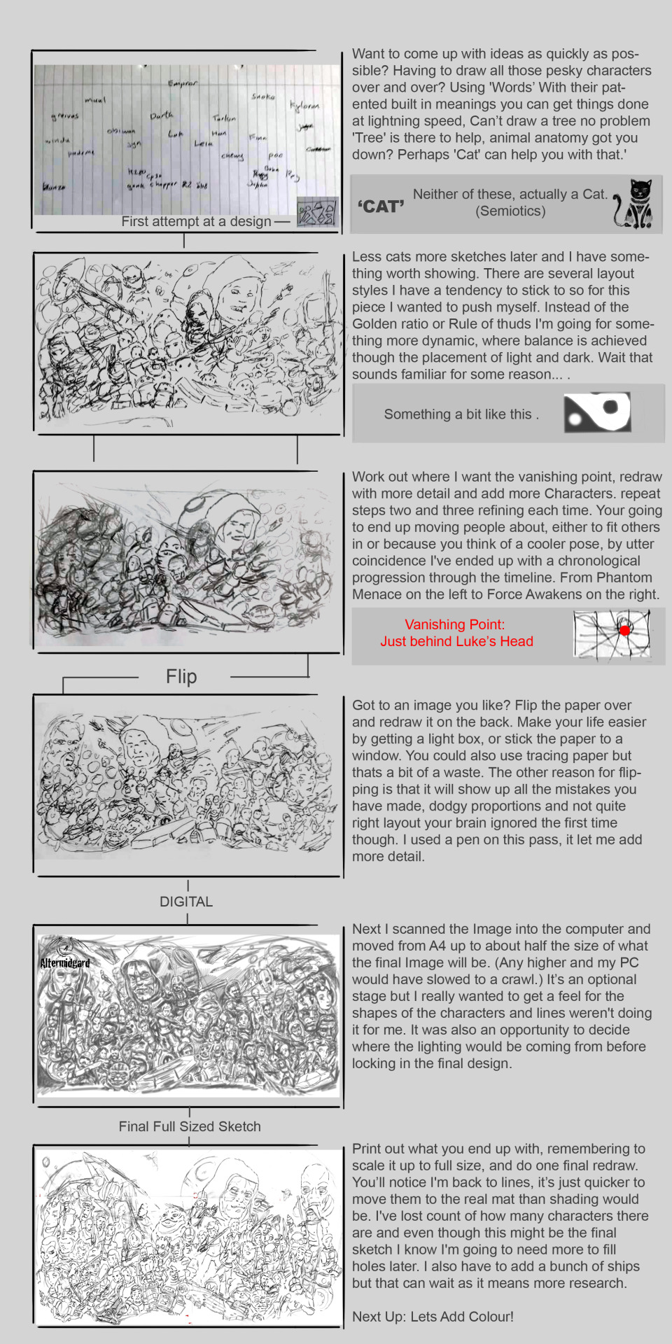
0 To 30
Thirty is a nice number, I've done mats with around that before, there should be enough space for everyone and more importantly it should be enough slots to cover all the main hero's and villains.
Step 1: Lets make a list.
If your playing along at home it's at this point you realise there might be a few more than thirty people in the Star Wars universe. It's Ok we can deal with this, we just have to organise everyone into some sort of hierarchy, most popular to least well known. OK, wow, yeah still quite a few people in category one.
This is where I was at. Making lists. I've been making mats a while now, you get an instinct for how many and how large the components of the design need to be. Thirty wasn’t an arbitrary number, it's what I considered the upper limit for readable characters to be. In first panel bellow that's how many names I finally settled on. There were many brave souls that fell by the wayside though and to be honest I wasn’t happy about it.
31 To 60
Writing the names on a scrap piece of A4 set the trend for the majority of the sketching phase. Usually I would draw thumbnails, four to eight images on one piece of paper but in this instance I needed to go bigger sooner. The second panel shows the most readable of my early sketches. All the previously names characters are there plus I'm starting to think that if I can get them all in at this size with extra space to spare there might be room to add a few more. Circles for heads is all they get right now but it might work. It just goes to show though. Until you actually start on something properly you cant know how its going to turn out.
The next panel is a more comprehensive redraw, more thought gets given to the layout and how the eye will flow around the image. While the rest of the design process is one of refinement and addition it.s here where the design mostly comes together. That's actuality one of the nice things about doing these blog posts. Looking back and trying to explain your thoughts and processed to others gives you insights on your own work you might never have noticed, I recommend people try it
Next up. Working on a light-box in pen gives me the opportunity to add even more detail. For some people this might not be the case but having that extra contrast and a finer point than most pencils really helps me out. The other nice thing about changing medium is that it alters the art style slightly. I'm making quicker more precise marks and it leads to a more dynamic atmosphere. The real trick will be trying to preserve that feel though the rest of the production
60 To 80
A different style again as I go digital. I'm using the airbrush tool and am less interested in line than I am the shape and weight of each object. It's also an early chance to test where the light should be coming fom. Where I've placed the vanishing point is causing a few hiccups. Triangular spaceships are especially hard to get right and a lot of their final placement has to do with that.
The silly thing is I could add more elements to the design. There's still plenty of room, think of the final total!. But no, at some point you have to take a step back and say 'this is a silly amount of work already and adding to it is going to do more harm to the design than good.
80 To,.. Who the heck knows.
I stopped counting at this point, didn't really want to know. We are almost there though. Most lines are either vertical, horizontal, or pointing at the vanishing point, I've got piles of spirals, and grievous's arms finally look right. Although Obi-Wan needs some work if they are going to duel. There are still questions to answer though. Things like what colour Lightsaber should Starkiller have and why is Luke's head not attached to his body. Enough sketching though, lets get started on the colouring,
Balancing the Force
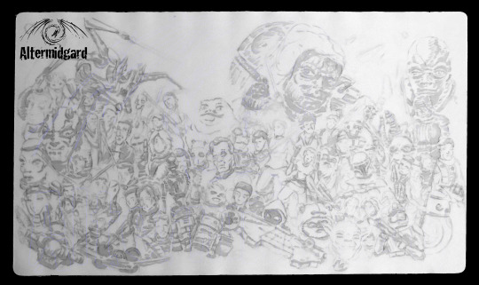
I say colouring. What I mean is 'lets use a light grey to work out the lighting'. The grey will be easily overwritten so we have a bit of room to experiment and it keep me from doing the outlines first. Another option would be to use yellow, it just comes down to what tone you want your image to take on. There's a lot of ships and metallic in this piece so I went with the grey.
Notice how the left half of the image is always darker? Tha'ts intentional. By loading up on characters there's just going to be more dark there. Why have I done this? Because it offsets the big blob of dark on the right that is the Emperor and Darth. Basically I'm looking to balance the force. Its also why Luke and Leia are in white. That and so they are the main focus of the image I want the ye to start or end thee.
It's a Trap
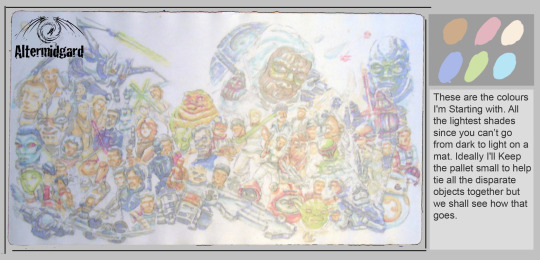
I don’t want to be using that many colours on this piece. With all the different people and objects here the composition could easily start to break up if everything got its own pallet. This stage then is about making sure that doesn’t happen, all the blues are the same blue, all the browns likewise. I think I even managed to stick with this rule all the way though which is good because it can be so tempting to just think, hmm what if I just add a smidge of this colour here?
I should really have added the ships at this stage though. You can already see how areas of the image I'm less sure about are falling behind the others in terms of how far along they are. (keep an eye on Darth for example)
This is the Droid I was Looking for
I was tempted to stop here.
.
.
.
I don’t normally do pastel shades but this was working, all I had to do was come up with a background and...
… Yeah, no, space is dark, I've designed myself into a comer so we will have to keep going.
If you have been wondering about why characters are where they are, beyond the timeline aspect, there were three other considerations.
1. Are you a bad-guy? If yes your probably a big floaty head the rest of the cast can anchor around.
2. Are you a hero? If yes, you probably have most or all of a body, good job you.
3. Are you someone I like? I'm colouring I don’t know how many people and have free reign, naturally your going to find that my preferences bleed into the design.
Yes that is why chopper is font and center.

Space is Big, Like Really Big.
I found these glitter gel pens. No idea if they would wok on this material but if they did it would make colouring stars way easier. Not particularly economical, I used them up just on the background but the nice thing about them is that the glitter breaks up the colours and gives a sense of depth to areas that would otherwise be large and flat. Time will tell if the stars stay on the mat, But you have to experiment right, how else do you learn new things?
I gave it an extra few layers of sealant just for go measure.
Back on topic. I might have gone a little hard on the quantity of red in Maul's face, it's started to spread. Luckily Thawn has darker hair so it's an easy fix but it's still a reminder not to get carried away.
Mostly Harmless
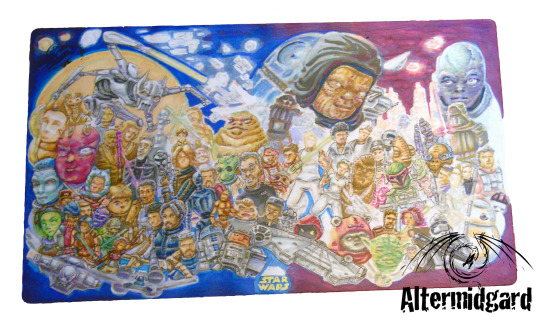
Hey Darth finally has arms, The pose took some time to get right to be honest. It had to fit the existing upper chest and head and align with the vanishing point since its so close. In the end I fond a one that had the Lightsaber out horizontal and after that it was just a case of getting the other arm right. I went back and forth on the city scene, easing the buildings then adding them back in. something needed to be there to contrast with the stuff in front but I just wasn’t feeling it. turns out they just hadn’t been dark enough and making them practically black with little window lights was the way forward.
Almost everything is in now, but as usual I still have the eyes on most of these people to add. I also need to do something with the Emperor. He's the biggest thing on the mat, he needs a little more respect/detail than I have given him so far.
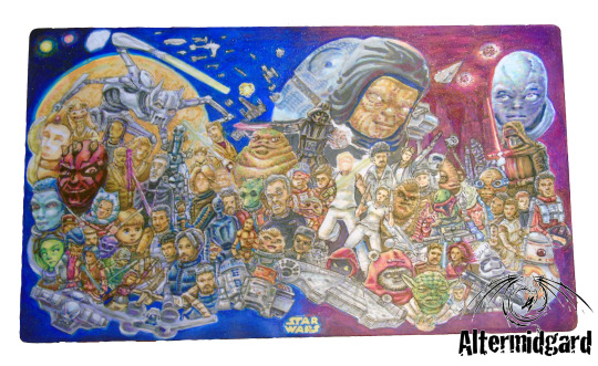
The Final Frontier.
Add clouds to the planets atmosphere, make the stars and Lightsabers glow in the dark (glow under UV light actually) and just generally go around tiding up. I'm just about done here. OK applying the sealant and taking pictures comes last but close enough.
I guess I should actually count the number of things on the mat then. Just a sec...
110ish! Give or take. That's quite a big number, and not something I think I'm going to be beating anytime soon. Probably...
Next time, lets simplify things a bit huh.
0 notes